This content is for the previous 4th version of Bootstrap
Download the latest Material Design for Bootstrap 5
Get 500+ material UI components, super simple 1 minute installation & much more
Free DownloadStyles customization
Important
To override MDB styles you need to use a higher hierarchy css selector (with higher specificity). Specificity is the set of rules applied to the CSS selectors that allow to determine which style is applied to an element. More specific selectors will take precedence over less specific selectors. We are constantly working on achieving the lowest possible level of style specificity in our components.
Global CSS styles
If you use css styles, the best way to overwrite MDB styles is to add the custom styles to the style.css file (./css/style.css). The good practice is addition custom selector to so that the custom styles affects only specific elements in the application.
<div class="container">
<div class="row">
<div class="col-md-6">
<!-- Card -->
<div class="card">
<!-- Card image -->
<img class="card-img-top" src="https://mdbootstrap.com/img/Photos/Others/images/43.webp" alt="Card image cap">
<!-- Card content -->
<div class="card-body">
<!-- Title -->
<h4 class="card-title"><a>Card title</a></h4>
<!-- Text -->
<p class="card-text">Some quick example text to build on the card title and make up the bulk of the card's
content.</p>
<!-- Button -->
<a href="#" class="btn btn-primary">Button</a>
</div>
</div>
<!-- Card -->
</div>
</div>
</div>
.your-card {
background-color: #263238;
color: #fff;
}
.your-card.card .card-text{
color: #fff;
}
In the example above only the second card will have custom styles
SCSS Styles
If you use scss, you can overwrite MDB styles by addition the custom styles to the _custom-styles.scss file (./scss/_custom-styles.scss). The good practice is addition custom selector to so that the custom styles affects only specific elements in the application.
        <div class="container">
          <div class="row">
            <div class="col-md-6">
              <!-- Card -->
              <div class="card">
                <!-- Card image -->
                <img class="card-img-top" src="https://mdbootstrap.com/img/Photos/Others/images/43.webp" alt="Card image cap">
                <!-- Card content -->
                <div class="card-body">
                  <!-- Title -->
                  <h4 class="card-title"><a>Card title</a></h4>
                  <!-- Text -->
                  <p class="card-text">Some quick example text to build on the card title and make up the bulk of the card's
                    content.</p>
                  <!-- Button -->
                  <a href="#" class="btn btn-primary">Button</a>
                </div>
              </div>
              <!-- Card -->
            </div>
            <div class="col-md-6">
              <!-- Card -->
              <div class="card">
                <!-- Card image -->
                <img class="card-img-top" src="https://mdbootstrap.com/img/Photos/Others/images/43.webp" alt="Card image cap">
                <!-- Card content -->
                <div class="card-body">
                  <!-- Title -->
                  <h4 class="card-title"><a>Card title</a></h4>
                  <!-- Text -->
                  <p class="card-text">Some quick example text to build on the card title and make up the bulk of the card's
                    content.</p>
                  <!-- Button -->
                  <a href="#" class="btn btn-primary">Button</a>
                </div>
              </div>
              <!-- Card -->
            </div>
          </div>
        </div>
        .your-card {
          .card {
            background-color: #263238;
            color: #fff;

            .card-text{
              color: #fff;
            }
          }
        }
In the example above only the second card will have custom styles
Bootstrap variables
Bootstrap variables are the storage locations paired with the associated symbolic names, which contain some known quantity of information referred to as the values.
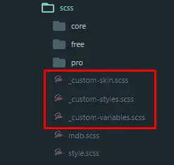
To improve the writing of a custom SCSS code in our package, from the MDB 4.5.2 version, there are three new files available, in which you can place various variables.

In the _custom-variables.scss you can add variables with the same names as ours and you want to overwrite them: $primary-color: #00695c;
In the _custom-skin.scss you can add an object with values to create your custom skin.
In the _custom-styles.scss you can add all other styles.
SCSS to CSS compilation
The browser cannot read scss code so you must compile the scss to css code. You will need SASS preprocessor to do this. Before you can use Sass, you need to install it and set it up on your project.
You can also use one of the VSCode extensions that allows SCSS compilations.
HTML Inline Styles
You can also override MDB styles by adding an inline CSS style to specific HTML elements.
        <div class="container">
          <div class="row">
            <div class="col-md-6">
              <!-- Card -->
              <div class="card">
                <!-- Card image -->
                <img class="card-img-top" src="https://mdbootstrap.com/img/Photos/Others/images/43.webp" alt="Card image cap">
                <!-- Card content -->
                <div class="card-body">
                  <!-- Title -->
                  <h4 class="card-title"><a>Card title</a></h4>
                  <!-- Text -->
                  <p class="card-text">Some quick example text to build on the card title and make up the bulk of the card's
                    content.</p>
                  <!-- Button -->
                  <a href="#" class="btn btn-primary">Button</a>
                </div>
              </div>
              <!-- Card -->
            </div>
            <div class="col-md-6">
              <!-- Card -->
              <div class="card your-card" style="background-color: #263238; color: #fff;">
                <!-- Card image -->
                <img class="card-img-top" src="https://mdbootstrap.com/img/Photos/Others/images/43.webp" alt="Card image cap">
                <!-- Card content -->
                <div class="card-body">
                  <!-- Title -->
                  <h4 class="card-title"><a>Card title</a></h4>
                  <!-- Text -->
                  <p class="card-text" style="color: #fff;">Some quick example text to build on the card title and make up the bulk of the card's
                    content.</p>
                  <!-- Button -->
                  <a href="#" class="btn btn-primary">Button</a>
                </div>
              </div>
              <!-- Card -->
            </div>
          </div>
        </div>
In the example above only the second card will have custom styles