React Bootstrap Icons
React Icons - Bootstrap 4 & Material Design
Note: This documentation is for an older version of Bootstrap (v.4). A
newer version is available for Bootstrap 5. We recommend migrating to the latest version of our product - Material Design for
Bootstrap 5.
Go to docs v.5
React Bootstrap icons usage is a quick tutorial which describes the proper way of using Font Awesome icons in Bootstrap framework.
MDB uses a powerful set of icons called Font Awesome.
One Font, 1500+ Icons
In a single collection, Font Awesome is a pictographic language of web-related actions.No JavaScript Required
Fewer compatibility concerns because Font Awesome doesn't require JavaScript.Infinite Scalability
Scalable vector graphics means every icon looks awesome at any size.Free, as in Speech
Font Awesome is completely free for commercial use.CSS Control
Easily style icon color, size, shadow, and anything that's possible with CSS.Perfect on Retina Displays
Font Awesome icons are vectors, which mean they're gorgeous on high-resolution displays.Accessibility-minded
Font Awesome loves screen readers and helps make your icons accessible on the web.Font Awesome version 5 has been re-written and re-designed completely from scratch.
What’s Changed
- 3 Different Icon Styles - every icon is introduced in a solid, regular, and light style. Brand icons are separated into their own style/category for easier use. Version 5 has four prefixes to let us set the style of any icon easily:
| New Prefix | Icon Style | SVG + JS Filename | Web Font Filename | Availability |
|---|---|---|---|---|
fab |
Font Awesome Brands | brands.js |
fa-brands-400.* |
Free |
fas or fa |
Font Awesome Solid | solid.js |
fa-solid-900.* |
Free |
far |
Font Awesome Regular | regular.js |
fa-regular-400.* |
Free/Pro. In the free version 151 icons are available. |
fal |
Font Awesome Light | light.js |
fa-light-300.* |
Pro only |
fad |
Font Awesome Duotone | duotone.js |
fa-duotone-900.* |
Pro only |
- Icon Name Changes - Aliases have been removed in version 5, each icon has one official name and some of those names have been adjusted under new standard and conventions.
- Outline Style Icons - Similarly, all icons that had an outlined style (and usually ended with -o) now have a prefix of far and have had their -o suffix removed.
We have implemented corresponding properties in our MDBIcon component. To find and fast implement your desired icon use our icon list with search tool.
Basic usage
Example: basic icon fa-camera-retro
You can place Font Awesome icons just about anywhere using the <MDBIcon>
component and
prop icon with the icon's
name. Font Awesome is designed to be used with inline elements.
              import React from "react";
              import { MDBIcon } from 'mdbreact';

              const IconsPage = () => {
                return (
                  <MDBIcon icon="camera-retro"/> fa-camera-retro
                );
              }

              export default IconsPage;
- Example: basic icon If you change the font-size of the icon's container, the icon gets bigger. Same thing goes for color, drop shadow, and anything else that gets inherited using CSS.
Larger icons
fa-lg
fa-2x
fa-3x
fa-4x
fa-5x
To increase icon sizes relative to their container, use the size="lg" (33%
increase), size="2x",
size="3x", size="4x", or size="5x" props.
                import React from "react";
                import { MDBIcon } from 'mdbreact';

                const IconsPage = () => {
                  return (
                    <>
                      <MDBIcon icon="camera-retro" size="lg"/> fa-lg
                      <MDBIcon icon="camera-retro" size="2x"/> fa-2x
                      <MDBIcon icon="camera-retro" size="3x"/> fa-3x
                      <MDBIcon icon="camera-retro" size="4x"/> fa-4x
                      <MDBIcon icon="camera-retro" size="5x"/> fa-5x
                    </>
                  );
                }

                export default IconsPage;
- If your icons are getting chopped off on top and bottom, make sure you have sufficient line-height.
Colors
amber-text
red-text
indigo-text
cyan-text
green-text
To see all colors options, go to colors list.
                import React from "react";
                import { MDBIcon } from 'mdbreact';

                const IconsPage = () => {
                  return (
                    <>
                      <p><MDBIcon icon="bolt" size="3x" className="amber-text pr-3" />amber-text</p>
                      <p><MDBIcon icon="bug" size="3x" className="red-text pr-3" />red-text</p>
                      <p><MDBIcon icon="heart" size="3x" className="indigo-text pr-3" />indigo-text</p>
                      <p><MDBIcon icon="bell" size="3x" className="cyan-text pr-3" />cyan-text</p>
                      <p><MDBIcon icon="birthday-cake" size="3x" className="green-text pr-3" />green-text</p>
                    </>
                  );
                }

                export default IconsPage;
Margins
ml-3
mr-3
mx-4
my-4
m-5
You can add spacing to your icons from the top, bottom, right, left or all sides. Look at here to see all possibilities.
                import React from "react";
                import { MDBIcon } from 'mdbreact';

                const IconsPage = () => {
                  return (
                    <>
                      <p><MDBIcon icon="gift" size="2x" className="pink-text ml-3" />ml-3</p>
                      <p><MDBIcon icon="gift" size="2x" className="pink-text mr-3" />mr-3</p>
                      <p><MDBIcon icon="gift" size="2x" className="pink-text mr-4" />mr-4</p>
                      <p><MDBIcon icon="gift" size="2x" className="pink-text my-4" />my-4</p>
                      <p><MDBIcon icon="gift" size="2x" className="pink-text m-5" />m-5</p>
                    </>
                  );
                }

                export default IconsPage;
Features
Icons are very useful when you want to show the features of something. Look at here to see more our features sections.
Why is it so great?
Lorem ipsum dolor sit amet, consectetur adipiscing elit, sed do eiusmod tempor incididunt ut labore et dolore magna aliqua. Ut enim ad minim veniam.
International
Lorem ipsum dolor sit amet, consectetur adipisicing elit. Reprehenderit maiores nam, aperiam minima assumenda deleniti hic.
Experimental
Lorem ipsum dolor sit amet, consectetur adipisicing elit. Reprehenderit maiores nam, aperiam minima assumenda deleniti hic.
Relaxing
Lorem ipsum dolor sit amet, consectetur adipisicing elit. Reprehenderit maiores nam, aperiam minima assumenda deleniti hic.
Beloved
Lorem ipsum dolor sit amet, consectetur adipisicing elit. Reprehenderit maiores nam, aperiam minima assumenda deleniti hic.
Rapid
Lorem ipsum dolor sit amet, consectetur adipisicing elit. Reprehenderit maiores nam, aperiam minima assumenda deleniti hic.
Magical
Lorem ipsum dolor sit amet, consectetur adipisicing elit. Reprehenderit maiores nam, aperiam minima assumenda deleniti hic.
import React from "react";
import { MDBRow, MDBCol, MDBIcon } from "mdbreact";
const FeaturesPage = () => {
return (
<section className="my-5">
<h2 className="h1-responsive font-weight-bold text-center my-5">
Why is it so great?
</h2>
<p className="lead grey-text w-responsive text-center mx-auto mb-5">
Lorem ipsum dolor sit amet, consectetur adipiscing elit, sed do
eiusmod tempor incididunt ut labore et dolore magna aliqua. Ut enim
ad minim veniam.
</p>
<MDBRow>
<MDBCol md="4">
<MDBRow className="mb-3">
<MDBCol size="2">
<MDBIcon
icon="flag-checkered"
size="2x"
className="deep-purple-text"
/>
</MDBCol>
<MDBCol size="10">
<h5 className="font-weight-bold mb-3">International</h5>
<p className="grey-text">
Lorem ipsum dolor sit amet, consectetur adipisicing elit.
Reprehenderit maiores nam, aperiam minima assumenda deleniti
hic.
</p>
</MDBCol>
</MDBRow>
<MDBRow className="mb-3">
<MDBCol size="2">
<MDBIcon icon="flask" size="2x" className="deep-purple-text" />
</MDBCol>
<MDBCol size="10">
<h5 className="font-weight-bold mb-3">Experimental</h5>
<p className="grey-text">
Lorem ipsum dolor sit amet, consectetur adipisicing elit.
Reprehenderit maiores nam, aperiam minima assumenda deleniti
hic.
</p>
</MDBCol>
</MDBRow>
<MDBRow className="mb-3">
<MDBCol size="2">
<MDBIcon icon="glass-martini" size="2x" className="deep-purple-text" />
</MDBCol>
<MDBCol size="10">
<h5 className="font-weight-bold mb-3">Relaxing</h5>
<p className="grey-text">
Lorem ipsum dolor sit amet, consectetur adipisicing elit.
Reprehenderit maiores nam, aperiam minima assumenda deleniti
hic.
</p>
</MDBCol>
</MDBRow>
</MDBCol>
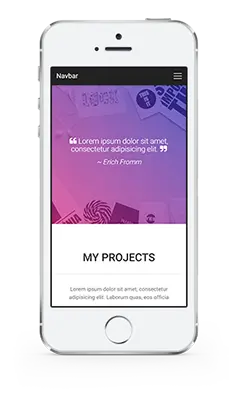
<MDBCol md="4" className="text-name">
<img
className="img-fluid"
src="https://mdbootstrap.com/img/Mockups/Transparent/Small/iphone-portfolio1.webp"
alt=""
/>
</MDBCol>
<MDBCol md="4">
<MDBRow className="mb-3">
<MDBCol size="2">
<MDBIcon icon="heart" size="2x" className="deep-purple-text" />
</MDBCol>
<MDBCol size="10">
<h5 className="font-weight-bold mb-3">Beloved</h5>
<p className="grey-text">
Lorem ipsum dolor sit amet, consectetur adipisicing elit.
Reprehenderit maiores nam, aperiam minima assumenda deleniti
hic.
</p>
</MDBCol>
</MDBRow>
<MDBRow className="mb-3">
<MDBCol size="2">
<MDBIcon icon="bolt" size="2x" className="deep-purple-text" />
</MDBCol>
<MDBCol size="10">
<h5 className="font-weight-bold mb-3">Rapid</h5>
<p className="grey-text">
Lorem ipsum dolor sit amet, consectetur adipisicing elit.
Reprehenderit maiores nam, aperiam minima assumenda deleniti
hic.
</p>
</MDBCol>
</MDBRow>
<MDBRow className="mb-3">
<MDBCol size="2">
<MDBIcon icon="magic" size="2x" className="deep-purple-text" />
</MDBCol>
<MDBCol size="10">
<h5 className="font-weight-bold mb-3">Magical</h5>
<p className="grey-text">
Lorem ipsum dolor sit amet, consectetur adipisicing elit.
Reprehenderit maiores nam, aperiam minima assumenda deleniti
hic.
</p>
</MDBCol>
</MDBRow>
</MDBCol>
</MDBRow>
</section>
);
}
export default FeaturesPage;
Rotated & Flipped
fa-rotate-90
fa-rotate-180
fa-rotate-270
fa-flip-horizontal
fa-flip-vertical
To arbitrarily rotate and flip icons, use the rotate="*" and flip="*".
                import React from "react";
                import { MDBIcon } from 'mdbreact';

                const IconsPage = () => {
                  return (
                    <>
                      <MDBIcon icon="shield-alt" /> normal<br />
                      <MDBIcon icon="shield-alt" rotate="90" /> fa-rotate-90<br />
                      <MDBIcon icon="shield-alt" rotate="180" /> fa-rotate-180<br />
                      <MDBIcon icon="shield-alt" rotate="270" /> fa-rotate-270<br />
                      <MDBIcon icon="shield-alt" flip="horizontal" /> fa-flip-horizontal<br />
                      <MDBIcon icon="shield-alt" flip="vertical" /> fa-flip-vertical
                    </>
                  );
                }

                export default IconsPage;
Animated Icons
Use the spin attribute to get any icon to rotate, and use pulse to have
it rotate
with 8 steps. Works well with spinner, refresh, and cog.
                import React from "react";
                import { MDBIcon } from 'mdbreact';

                const IconsPage = () => {
                  return (
                    <>
                      <MDBIcon icon="spinner" spin size="3x" fixed />
                      <span className="sr-only">Loading...</span>

                      <MDBIcon icon="circle-notch" spin size="3x" fixed />
                      <span className="sr-only">Loading...</span>

                      <MDBIcon icon="sync" spin size="3x" fixed />
                      <span className="sr-only">Loading...</span>

                      <MDBIcon icon="cog" spin size="3x" fixed />
                      <span className="sr-only">Loading...</span>

                      <MDBIcon icon="spinner" pulse size="3x" fixed />
                      <span className="sr-only">Loading...</span>
                    </>
                  );
                }

                export default IconsPage;
Note: Some browsers on some platforms have issues with animated icons resulting in a jittery wobbling effect. See issue #671 for examples and possible workarounds.
Note: CSS3 animations aren't supported in IE8 - IE9.
Bordered & Pulled Icons
Use border and pull="right" or pull="left" for easy pull
quotes or
article icons.
                import React from "react";
                import { MDBIcon } from 'mdbreact';

                const IconsPage = () => {
                  return (
                    <>
                      ...tomorrow we will run faster, stretch out our arms farther...
                      And then one fine morning— So we beat on, boats against the
                      current, borne back ceaselessly into the past.
                      <MDBIcon icon="quote-left" size="1x" pull="left" border />
                      ...tomorrow we will run faster, stretch out our arms farther...
                      And then one fine morning— So we beat on, boats against the
                      current, borne back ceaselessly into the past.
                    </>
                  );
                }

                export default IconsPage;
Fixed Width Icons
Use fixed to set icons at a fixed width. Great to use when different icon widths
throw off
alignment.
Especially useful in things like nav lists & list groups.
                import React from "react";
                import { MDBIcon, MDBListGroup, MDBListGroupItem } from 'mdbreact';

                const IconsPage = () => {
                  return (
                    <MDBListGroup >
                      <MDBListGroupItem><MDBIcon icon="home" fixed />  Home</MDBListGroupItem>
                      <MDBListGroupItem><MDBIcon icon="book" fixed />  Library</MDBListGroupItem>
                      <MDBListGroupItem><MDBIcon icon="pencil-alt" fixed />  Applications</MDBListGroupItem>
                      <MDBListGroupItem><MDBIcon icon="cog" fixed />  Settings</MDBListGroupItem>
                    </MDBListGroup>
                  );
                }

                export default IconsPage;
List Icons
- List icons
- can be used
- as bullets
- in lists
Use fa-ul and list to easily replace default bullets in unordered
lists.
                import React from "react";
                import { MDBIcon } from 'mdbreact';

                const IconsPage = () => {
                  return (
                    <ul className="fa-ul">
                      <li><MDBIcon icon="check-square" list />  List icons</li>
                      <li><MDBIcon icon="check-square" list />  can be used</li>
                      <li><MDBIcon icon="spinner" list spin />  as bullets</li>
                      <li><MDBIcon icon="square" list />  in lists</li>
                    </ul>
                  );
                }

                export default IconsPage;
Full list
To see the full list of available icons click the button below
React Icon - API
In this section you will find advanced information about the Icon component. You will learn which modules are required in this component, what are the possibilities of configuring the component, and what events and methods you can use in working with it.
Import statement
import { MDBIcon } from "mdbreact";
API Reference: Icon Properties
The table below shows the configuration options of the MDBIcon component.
| Name | Type | Default | Description | Example |
|---|---|---|---|---|
border |
Boolean | false |
Adds border around icon | <MDBIcon border > |
brand |
Boolean | false |
Sets brand icon category; alias: fab | <MDBIcon brand icon="twitter" > |
className |
String | |
Adds custom classes | <MDBIcon icon="envelope" className="customClass" > |
fab |
Boolean | false |
Sets brand icon category; alias: brand | <MDBIcon fab icon="twitter" > |
fal |
Boolean | false |
Sets light icon category; alias: light | <MDBIcon fal icon="user" > |
far |
Boolean | false |
Sets regular icon category; alias: regular | <MDBIcon far icon="user" > |
fixed |
Boolean | false |
Sets fixed with of icons (f.e. inside list) | <MDBIcon icon="user" fixed > |
flip |
String | |
Flips icon; acceptable props: horizontal or vertical |
<MDBIcon icon="user" flip="horizontal" > |
icon |
String | |
Required! The Font Awesome icon name, which you want to use Icons list |
<MDBIcon icon="chevron" > |
inverse |
Boolean | false |
Sets alternative icon color | <MDBIcon icon="user" inverse > |
light |
Boolean | false |
Sets light icon category; alias: fal | <MDBIcon light icon="user" > |
list |
Boolean | false |
Use inside list with class fa-ul to replace bullets with icons |
<MDBListGroup className="fa-list">
  <MDBIcon icon="user" list />
</MDBListGroup>
|
pull |
String | |
Pulls icon to the right or left |
<MDBIcon icon="user" pull="right" > |
pulse |
Boolean | false |
Rotates icon in 8 steps | <MDBIcon pulse > |
regular |
Boolean | false |
Sets regular icon category; alias: far | <MDBIcon far icon="user" > |
rotate |
String | |
Rotates icon by 90, 180 or 270 degrees |
<MDBIcon icon="user" rotate="270" > |
size |
String | |
Increase icon size; accepts parameters: [lg, 2x, 3x, 4x, 5x] |
<MDBIcon icon="user" size="3x" > |
spin |
Boolean | false |
Spins the icon, you can combine this prop with pulse |
<MDBIcon spin > |
stack |
String | |
Use class fa-stack on wrapper to stack multiple icons; use 1x for regular
sized icon and 2x for larger one |
<span className="fa-stack">
  <MDBIcon far icon="square" stack="2x" />
  <MDBIcon fab icon="twitter" stack="1x" />
</span>
|